Quick answer
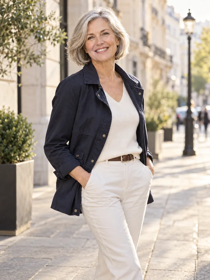
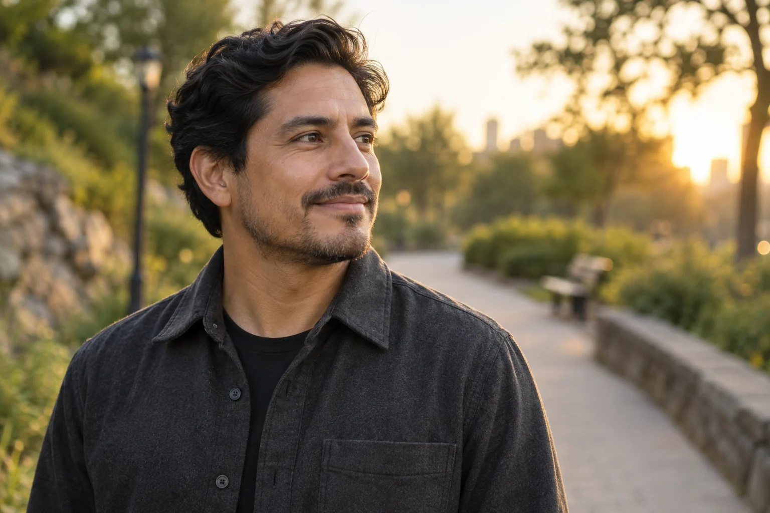
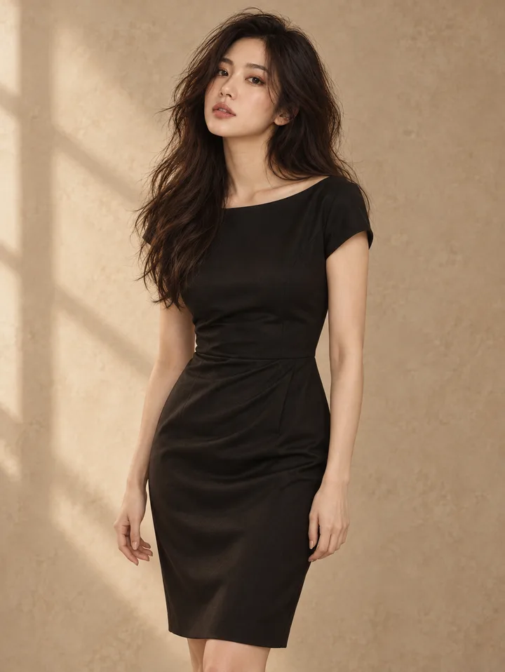
A headshot is a closely framed photograph focused on a person's face from the chest or collarbone up, engineered primarily for immediate visual recognition. An environmental portrait is a wider composition that captures the subject within their actual work, creative, or living surroundings, using physical setting, tools, and negative space to communicate professional context and narrative depth.
Choosing between an environmental portrait and a standard headshot is not a matter of visual preference; it is a layout and communication decision determined by the destination channel. If an image must live inside a compact directory grid, an avatar circle, or a mobile team card, a face-led headshot ensures immediate legibility at small scale. If an image anchors a desktop About page hero section, an editorial press feature, or a long-form interview, an environmental portrait provides the surrounding detail necessary to convey what you do, how you work, and the atmosphere of your practice.
The Core Distinction: Recognition Versus Context
The technical boundary separating these two formats comes down to framing, depth of field, and narrative intent:
| Factor | Standard Headshot | Environmental Portrait |
|---|---|---|
| Primary Framing | Tight crop; collarbone, chest, or shoulders to head | Medium to wide shot; waist-up, three-quarter, or full-body |
| Background Treatment | Neutral, solid studio backdrop or soft, indistinct blur | Discernible real-world environment (studio, office, workshop, outdoors) |
| Visual Function | Instant recognition and personal identity | Context, craft, professional setting, and narrative storytelling |
| Negative Space | Minimal; the subject fills 70% to 85% of the frame | Moderate to high; environment and negative space balance the subject |
| Scale Resilience | Retains clarity at tiny dimensions (e.g., 32×32px to 128×128px) | Requires larger display dimensions (e.g., 600px+ width) to be legible |
| Primary Placements | Team cards, LinkedIn profile avatars, conference badges, directories | About page hero banners, editorial articles, press kits, speaking pages |
As discussed in photography analyses of natural backgrounds versus studio backdrops, neutral backdrops deliberately remove distractions so the viewer focuses entirely on the subject's facial expression, eyes, and micro-cues. An environmental portrait does the opposite: it deliberately incorporates the physical setting—a design studio table, an architectural model, an editing suite, or a bookshelf—to signal competence and domain experience without requiring explanatory caption text.
Channel Map: Matching Image Type to the Page
A common mistake in digital publishing is placing an environmental portrait into a UI component designed for a headshot, or vice versa. Review how each image type behaves across primary digital channels:
1. Team Cards and Directory Grids
- Recommended Format: Tight-crop headshot.
- Why: Team pages typically present multiple colleagues in modular grid cards or circular containers. When an environmental portrait is reduced to a 150-pixel thumbnail, the subject's face shrinks to an unreadable dot, and surrounding objects turn into visual noise. Headshots maintain visual consistency and rapid recognition across uniform team galleries.
- Cropping Rule: For circular or square directory layouts, review the framing principles in our guide on how to crop profile photos for circles and squares to ensure adequate head space without clipping the chin.
2. About Pages and Founder Profiles
- Recommended Format: Environmental portrait as the lead image; optional secondary headshot.
- Why: An About page is an exploratory destination where visitors actively seek to understand who you are and how you operate. A wide or medium environmental portrait showing you in a truthful workspace establishes immediate atmosphere.
- Placement Strategy: Use an environmental portrait in the hero section or alongside your primary narrative bio, leaving tight headshots for secondary author bylines or sidebar contact widgets. For broader layout strategies, consult our guide on personal brand photos for About pages.
3. Press Kits and Media Features
- Recommended Format: Both formats packaged together.
- Why: Journalists, podcast hosts, and event organizers have distinct layout constraints. A publication running a feature profile needs a horizontal environmental portrait to fill a wide editorial layout. Conversely, a panel moderator compiling a digital event flyer needs a tight square headshot. Supplying both formats in your downloadable press kit eliminates back-and-forth friction.
4. Social Media Profiles (Avatars vs. Header Banners)
- Recommended Format: Headshot for the avatar; environmental portrait for the banner.
- Why: Profile avatars on platforms like LinkedIn, X, and GitHub are small and frequently displayed on mobile devices. Avatars should always prioritize face recognition. The wide background banner, however, offers ample horizontal space where an environmental shot or contextual workspace photo can communicate your field of work.
+-------------------------------------------------------------------------------+
|                            Asset Selection Matrix                             |
+-------------------------------------------------------------------------------+
| Placement / Channel       | Headshot Suitability   | Environmental Portrait   |
+---------------------------+------------------------+--------------------------+
| Small Profile Avatar      | High (Essential)       | Unusable (Face too small)|
| Team Member Directory Card| High (Clean & uniform) | Low (Cluttered in grids) |
| About Page Hero Section   | Moderate (Functional)  | High (Adds narrative)    |
| Press Kit / Speaker Bio   | High (Flyers/Badges)   | High (Editorial stories) |
| Social Profile Banner     | Low (Aspect mismatch)  | High (Utilizes width)    |
+-------------------------------------------------------------------------------+
What to Hold Constant Before Comparing Options
When evaluating whether a headshot or an environmental portrait serves your page best, you must isolate the format variable. If you compare a professional studio headshot taken with prime lenses against a blurry, poorly lit smartphone snapshot taken at a coffee shop, you are comparing lighting quality and technical resolution, not the communication value of the environment.
To conduct a clean comparison:
- Hold Likeness Constant: Both images must represent your current appearance, including current hairstyle, typical eyewear, and natural grooming.
- Hold Wardrobe Appropriate to the Role: The clothing in both shots should align with your actual professional standard. Do not compare formal business attire in a headshot against casual loungewear in an environmental shot unless that contrast is the specific editorial focus.
- Change One Variable at a Time: If you are testing background settings, keep your facial expression, general lighting angle, and pose stable so you can objectively evaluate how much the setting adds or detracts from the image.
- Avoid False Work Contexts: Authenticity is paramount. An engineer photographed in a rented medical laboratory or an independent consultant staged in a boardroom they do not use creates false context that erodes credibility upon closer inspection.
Step-by-Step Selection and Testing Workflow
Follow this workflow to select, crop, and review the right image for your specific web page:
Step 1: Define the Display Boundary
Measure the actual container size on your target page. Determine whether the asset will render in a flexible responsive container, a fixed-ratio card (such as 1:1 square or 4:5 vertical), or a circular CSS mask.
Step 2: Test Scale Down to Smallest Viewport
Take your candidate images and resize them to a 100-pixel width preview.
- Can you immediately identify the person's eyes, expression, and identity?
- Does the background dissolve into distracting, muddy textures? If the subject becomes indistinguishable at mobile scale, the image must be cropped tighter or replaced with a standard headshot.
Step 3: Evaluate Negative Space for Text Overlays
If the image will be used in an About page banner, assess whether the composition provides negative space—uncluttered areas of wall, sky, or neutral room tone—where headline typography or call-to-action buttons can sit without legibility conflicts. Tight headshots rarely leave sufficient negative space for typography.
Step 4: Explore Controlled Setting Variations
If you need to explore how different settings or crops complement your page before booking an on-location photographer, you can use personal photo styling tools to test options. For instance, LookScene offers an invitation-preview personal AI photo styling tool for adults using their own photos. It allows users to explore hairstyle, outfit, and portrait-setting variations in a controlled environment.
[!NOTE] LookScene examples are editorial styling illustrations. The tool does not provide garment sizing, exact-SKU try-on, wardrobe management, human styling, team administration, or guarantees regarding identity preservation, real hair textures, fabric weight, or exact body proportions. It is intended as an exploratory styling aid, not a replacement for verified real-world photography.
How to Reject Misleading or Unusable Results
Whether you are reviewing proofs from an on-location photo shoot or evaluating exploratory concepts generated through styling tools, establish rigid reject criteria. Discard any image that exhibits the following defects:
- Identity Drift: The image no longer looks like you when viewed by a colleague or client in real life. Any subtle alteration to jawline proportions, eye spacing, or distinctive facial features must trigger an immediate reject.
- Distorted Anatomy or Uncanny Textures: Check hands, ears, hair strands, collar seams, and glasses frames. If hands appear blurred, fingers misshapen, or jewelry blended directly into the skin, the image cannot be used in professional contexts.
- Fabricated or Incongruent Backgrounds: An environmental background must feel plausible for your actual work. If lighting directions between the subject's face and the surrounding background do not match, the composition creates an uncanny, pasted-on appearance that visitors instinctively distrust.
- Over-Processed Skin and Lighting: Excessive smoothing or synthetic HDR lighting strips away authentic skin texture, giving the image an artificial, plastic appearance that undermines personal credibility.
+-------------------------------------------------------------------------+
|                       Image Quality Gate: Pass / Fail                   |
+-------------------------------------------------------------------------+
| Verification Item        | Pass Criteria        | Immediate Fail        |
+--------------------------+----------------------+-----------------------+
| Likeness & Proportions   | Matches real-world   | Facial drift; altered |
|                          | features exactly     | jaw or eye geometry   |
| Background Lighting      | Light angles match   | Mismatched shadows or |
|                          | subject illumination | floating edges        |
| Context Truthfulness     | Plausible, relevant  | Staged or fabricated  |
|                          | work setting         | false environment     |
| Edge Definition          | Crisp hair/shoulder  | Blurry halo, melted   |
|                          | separation           | collars or artifacts  |
+-------------------------------------------------------------------------+
Trade-Offs, Product Limits, and Verification
Every image choice involves operational and aesthetic trade-offs:
- Headshots offer maximum versatility, fit almost every standardized UI component, and are inexpensive to maintain. However, they lack narrative distinctiveness and can make personal websites feel corporate and interchangeable.
- Environmental Portraits build character, convey authority, and elevate web design. However, they are sensitive to layout cropping, fail at small avatar scales, and require deliberate composition to prevent the setting from overpowering the subject.
Understanding Product and Workflow Limits
When exploring settings with exploratory digital styling platforms, keep public system limits in mind:
- Free Invitation Preview: LookScene currently operates as a free invitation preview for adults using their own photos. While paid packages are displayed as planned features on the platform, they are not available during the current preview period.
- Exploration vs. Production: Use styling tools strictly to preview composition ideas, wardrobe palettes, and setting concepts. Do not rely on synthetic tools to generate final professional images where guaranteed facial likeness or legal identity representation is required.
- Human Verification: Always cross-check candidate images with an objective third party before deploying them to public-facing pages. Ask whether the image accurately reflects how you appear in a video meeting or an in-person consultation.
Final Review Checklist and Next Action
Before publishing your chosen image to an About page, directory, or press kit, verify each step:
- Placement Match: Did you choose a tight headshot for avatars and directories, or an environmental portrait for wide editorial blocks?
- Legibility at Scale: Have you tested the image at its smallest rendered size on mobile screens?
- Truthful Context: Does the background reflect an authentic professional environment rather than an exaggerated or fabricated scene?
- Likeness Verification: Are facial features, hair, and body proportions entirely free from synthetic distortion or drift?
- Aspect Ratio Alignment: Does the image crop naturally into the target container without clipping the top of the head or chin?
- Negative Space: If text overlays are planned, is there clean negative space to ensure legible contrast?
Next Action
If your current website relies entirely on generic headshots, audit your About page and press materials. Identify one prominent placement where an environmental portrait can provide helpful narrative context about your work. If you have an existing photo and wish to explore how different settings or outfit styles balance against your layout, test a controlled change using an exploratory tool like the LookScene AI Photoshoot during its free preview, or coordinate with a professional photographer to stage an authentic, on-location portrait.