Quick answer
To compare outfit colors accurately on a single photograph, you must isolate color as your only variable. When an image editing or AI tool alters your shoulder width, cinches your waistline, adjusts your head tilt, or swaps out your background while changing a shirt or blazer color, the comparison is invalidated. You are no longer evaluating how a specific shade interacts with your skin tone and hair; you are reacting to an entirely different body shape, posture, and lighting environment.
A reliable color comparison requires holding five elements completely stationary: your facial identity, your physical body proportions, your pose, the garment’s silhouette, and the background lighting. By locking these factors in place and testing only two or three realistic shades at a time, you can evaluate near-face contrast and backdrop separation with objective precision. If any tool alters your proportions or reshapes your clothes in the process, that result must be rejected immediately.
+-------------------------------------------------------------------------+
|                    THE CONTROLLED COLOR COMPARISON                      |
+-------------------------------------------------------------------------+
|  LOCKED BASELINE (Zero Drift Permitted) :                                |
|  [ Face & Likeness ] [ Body Proportions ] [ Pose ] [ Silhouette ]       |
|                                                                         |
|  TEST VARIABLE (Isolate One Property)  :                                |
|  [ Colorway A: Navy ] vs. [ Colorway B: Charcoal ] vs. [ Colorway C ]   |
|                                                                         |
|  EVALUATION CRITERIA                   :                                |
|  - Near-face contrast (does it wash out skin or define jawline?)        |
|  - Background separation (does it disappear into the backdrop?)         |
+-------------------------------------------------------------------------+
Who This Workflow Is For (and When to Step Away)
This controlled testing workflow is designed for practical wardrobe decisions where visual contrast and tone near the face matter most. It is particularly useful for:
- Professional headshot planning: Testing whether a dark neutral (such as navy or charcoal) provides better separation against a studio backdrop than a mid-tone gray, as outlined in wardrobe standards by Palm Lake Headshots.
- Executive and speaker portraits: Deciding between two classic blazer shades to ensure proper contrast under camera flash or stage lights.
- Targeted capsule wardrobe additions: Comparing two specific colorways of an everyday jacket or knit before committing to a physical purchase.
When Another Method Is Safer
This workflow does not replace physical tailoring or in-person styling. Do not use photo color-swapping for:
- Garment sizing and drape: Static photo editing cannot predict how a fabric will drape across your shoulders or fit around your chest.
- Exact-SKU virtual try-on: AI styling tools do not have access to specific retail inventory measurements or exact fabric dye formulas.
- Seasonal color diagnosis: Avoid algorithmic or generic "color season" analysis that promises universal flattering palettes. Colors function based on relative lighting, background contrast, and personal preference, not automated rules.
If you need to evaluate physical fit, comfort, or true fabric texture, ordering swatches or trying on physical garments in daylight is the only reliable route.
What to Hold Constant Before Comparing Options
To establish a truthful visual audit, your baseline photograph must meet strict control standards. If your source image is noisy, awkwardly cropped, or unevenly lit, editing tools are far more likely to hallucinate changes to your anatomy.
+-------------------------------------------------------------------------+
|                       BASELINE CONTROL CRITERIA                         |
+-------------------------------------------------------------------------+
| Element           | Control Standard                                    |
+-------------------+-----------------------------------------------------+
| Facial Likeness   | Eyes, nose, jawline, and skin texture remain        |
|                   | identical to the source photograph.                 |
| Body Silhouette   | Shoulder width, torso dimensions, and posture       |
|                   | show zero slimming, bulk, or warping.               |
| Garment Cut       | Lapel notch, collar height, seam placement, and     |
|                   | neckline depth remain completely unchanged.         |
| Background Setup  | Color, illumination angle, and depth of field       |
|                   | remain identical across all tested variations.      |
+-------------------+-----------------------------------------------------+
1. Garment Silhouette and Seam Lines
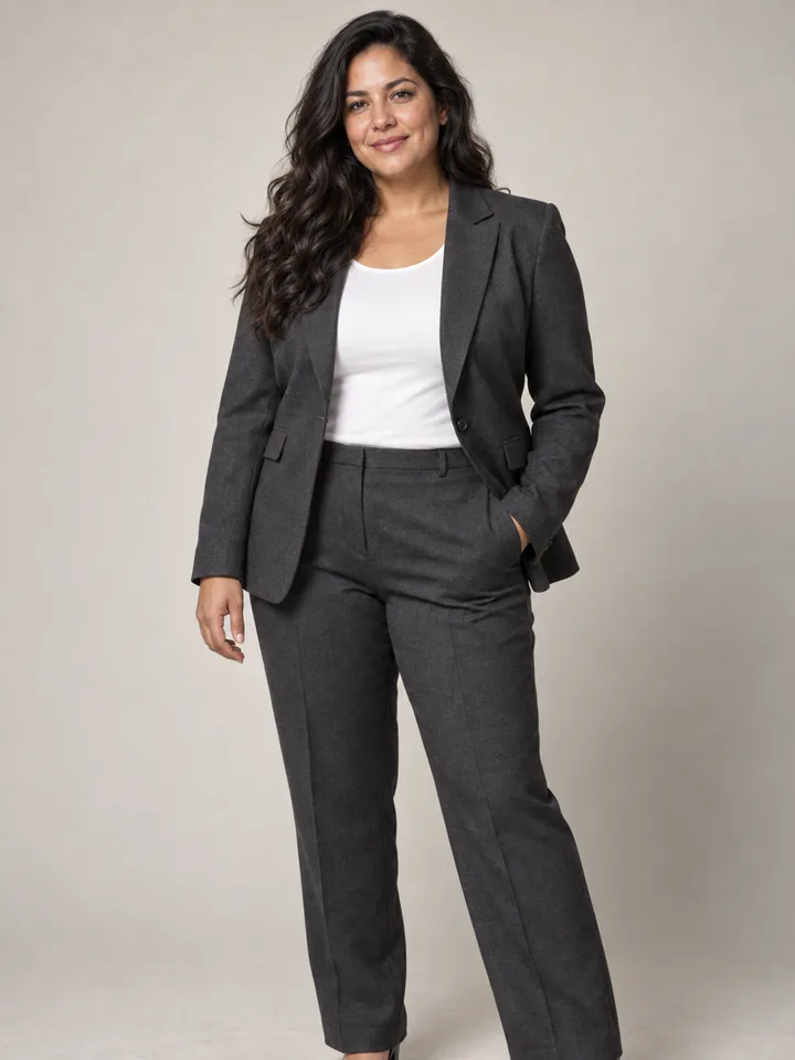
The garment structure must remain static. If you upload a photo wearing a notch-lapel blazer, the edited colorways must keep that exact lapel width, collar height, and button stance. If a software tool replaces your tailored blazer with an open cardigan or changes a crewneck into a V-neck, discard the output. Neckline depth changes how light reflects onto your throat and jaw, obscuring the true effect of the color.
2. Physical Proportions and Posture
A frequent issue with generative image tools is body modification. As documented by users on Reddit r/AIAssisted, image generation platforms often alter a subject's body shape, narrowing waists or exaggerating muscle tone when adjusting garments. A legitimate color test must retain your actual body proportions without subtle digital alterations.
3. Facial Geometry and Skin Undertone
Your face must remain your face. Generative algorithms can drift when modifying adjacent pixels, leading to smoothed skin, altered jawlines, or modified eye shapes—a problem frequently highlighted in technical discussions on Reddit r/StableDiffusion. If an edit changes your facial features or applies an artificial tanning filter, your comparison is compromised.
4. Background and Lighting Environment
Perceived color is entirely dependent on ambient light. A navy suit viewed in direct sunlight reads differently than the same suit in a windowless studio. To compare two colors honestly, the ambient lighting direction, color temperature, and backdrop shade must remain identical across all versions.
Step-by-Step Process: Comparing Colors on One Source Photo
Follow this structured process to evaluate two or three colors without introducing unwanted visual drift.
[ Step 1: Baseline ] ──> [ Step 2: Select Colors ] ──> [ Step 3: Single-Var Edit ]
                                                                 │
[ Step 6: Decide ]   <── [ Step 5: Contrast Audit ] <── [ Step 4: Reject Drift ]
Step 1: Select a Neutral Baseline Capture
Choose a clear, sharp photograph taken in balanced, indirect daylight or neutral studio lighting.
- Stand or sit in an upright, relaxed posture facing the camera directly or at a slight, natural angle.
- Wear a solid-colored, well-fitting top or jacket with simple lines.
- Ensure your hair is styled off your collar and shoulders so garment edges remain sharply visible.
Step 2: Define Two or Three Specific Colorways
Limit your test to a maximum of three discrete options. Comparing dozens of variations simultaneously leads to visual fatigue. Focus on specific, grounded shades rather than vague descriptive concepts:
- Comparison A: Deep Charcoal Gray (
#36454F) vs. True Navy Blue (#000080) - Comparison B: Dark Olive (
#556B2F) vs. Camel/Warm Tan (#C19A6B) - Comparison C: Soft Off-White/Ivory (
#FFFFF0) vs. Crisp Optical White (#FFFFFF)
Step 3: Run Single-Variable Modifications
Using an exploration tool such as the LookScene outfit changer, modify only the color attribute while instructing the tool to preserve the existing clothing shape, pose, and background. For guidance on structuring prompts and isolating single attributes, review our guide on exploring one outfit with a different mood.
Step 4: Perform a 100% Zoom Alignment Audit
Place the source photo and the newly generated colorways side-by-side on a desktop display. Zoom in to 100% and examine the transition boundaries:
- The Neck and Collar Line: Did the fabric boundary creep up or down against your neck?
- The Shoulder Seams: Are your shoulder points in the exact same pixel coordinates as the original?
- The Jawline and Ears: Did the edge of the collar blur or distort the natural outline of your jaw?
Step 5: Audit Face Contrast and Background Separation
Once structural consistency is verified, evaluate how the color interacts with your features:
- Near-Face Contrast: Does the color bring definition to your jawline, or does it cast an unflattering gray or sallow cast across your chin?
- Backdrop Separation: If you are preparing a portrait against a charcoal backdrop, does a navy blazer provide clean separation, or does it disappear into the background?
How to Reject Misleading or Unusable Results
When evaluating AI-assisted photo edits, knowing what to discard is more important than choosing what you like. Generative systems are prone to subtle hallucinations that make an outfit look subjectively appealing while completely invalidating it as a practical reference.
Use this decision matrix to determine whether an output is usable:
| Inspection Area | Pass Criteria | Immediate Reject Criteria |
|---|---|---|
| Body Shape | Torso width, waistline, and arms match source photo exactly. | Visible waist narrowing, altered posture, or inflated shoulder width. |
| Face & Identity | Natural facial geometry, blemishes, and eye shapes are preserved. | Smoothed skin texture, modified nose/jaw contours, or changed makeup. |
| Garment Cut | Collar style, lapel width, and seam placements remain static. | Crewneck turns into V-neck; lapels change size or disappear entirely. |
| Color Isolation | Only the targeted clothing item shifts in hue and saturation. | Background changes tint; hair color or skin tone shifts with the shirt. |
| Fabric Believability | Texture remains consistent with realistic woven textiles. | Fabric turns into high-gloss plastic or liquid-like sheen. |
For an in-depth framework on identifying visual artifacts and structural drift, refer to our detailed tutorial on how to review AI outfit results.
Trade-Offs, Product Limits, and Real-World Verification
Digital color comparisons offer rapid initial feedback, but they come with inherent technical boundaries that must be factored into your decision.
Screen Color vs. Physical Dye Realities
Monitors display color through transmitted RGB light, whereas real-world clothing reflects ambient light off dyed physical fibers. A deep forest green that appears rich and vibrant on an OLED smartphone screen may look dull or muddy on a matte wool blend under fluorescent office lighting. Never assume a digital hex code will translate into an exact fabric match at retail.
LookScene Product Boundaries
LookScene is designed as a personal AI styling exploration tool for adults using their own photos. It allows users to explore hairstyle, outfit, and portrait-setting options quickly. However, several clear operational boundaries apply:
- No Sizing or Fit Guidance: LookScene does not provide clothing sizing, dimensional measurements, or pattern fitting.
- No Exact-SKU Matching: The platform is an exploratory visualization tool, not a retail inventory virtual try-on engine.
- No Identity or Proportions Guarantee: Generative tools can introduce subtle anatomical shifts; users must actively inspect and reject drifted images.
- Free Invitation Preview: LookScene is currently operating as a free invitation preview. While paid packages and tiers are displayed as planned features, they are not available for purchase at this time.
+-------------------------------------------------------------------------+
|                      REAL-WORLD TRANSLATION AUDIT                       |
+-------------------------------------------------------------------------+
| DIGITAL PREVIEW                      PHYSICAL REALITY                   |
| - RGB backlit display        ──>     - Reflected ambient light          |
| - Perfectly flat illumination ──>    - Variable indoor/outdoor light    |
| - Synthetic fabric texture   ──>     - Natural fiber weave & weight     |
+-------------------------------------------------------------------------+
| RULE: Use digital previews to evaluate contrast and value depth;        |
| rely on physical fabric swatches to confirm final dye shades.          |
+-------------------------------------------------------------------------+
Final Checklist and Next Action
Before using any photo color comparison to make a shopping, tailoring, or headshot wardrobe decision, verify your outputs against this checklist:
- Single baseline: All colorways were generated from the exact same unedited source photograph.
- No anatomical drift: Shoulder width, waistline, and facial contours match the baseline pixel-for-pixel.
- Identical silhouette: The collar style, lapel shape, and neckline depth did not change between variations.
- Lighting consistency: The background shade and directional lighting did not shift to flatter a specific color.
- Two-to-three limit: You evaluated no more than three colors at one time to avoid visual confusion.
- Clear contrast outcome: You identified which shade provides the cleanest separation against your face and expected background.
Next Action
If your goal is exploring personal styling concepts, you can test a single-variable color comparison using the LookScene outfit changer during the free invitation preview. Remember to inspect each result critically and reject any image that alters your body or face.
If you are preparing for a high-stakes corporate headshot or formal event, take your approved digital color directions to a physical store or tailor, hold real fabric swatches against your face in natural light, and make your final decision based on physical reality.